Cartography

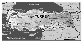
Cartography is more than just making maps - it's both an art and a science that involves techniques and nuances that are learned and discovered over time. The science behind cartography can be as specific as where to place a city name relative to the city point or as general as picking colors, but these are equally important elements when creating a map that is both aesthetically pleasing and informative. Maximizing the information that is displayed on a map, while not cluttering the map is usually my main goal. Maps can display information that is hard to understand in other forms such as tables or text. The map on the left (click to enlarge) was one of many created for Government and Politics of the Middle East and North Africa, Sixth Edition.
More Than Just a Pretty Map

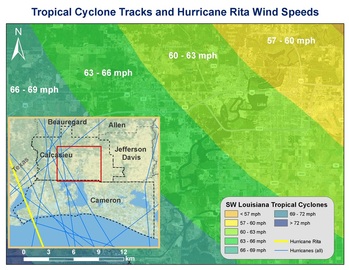
Cartography is a major component of geography since much of our research involves analyzing problems from both a spatial and temporal perspective. Maps help visualize a multitude of issues across space and time. Where were Hurricane Rita winds the strongest in Lake Charles, Louisiana? Check out the map on the right to find out. Where have other hurricanes made landfall in the same region? Check out the map inset. Where is the current suitable habitat for a puma in the USA? Check out the map in the Biogeography/Conservation section. Where is the winter-time Siberian high located? Check out the second map in the Climatology section. Almost every section of this website has a map and that is not by mistake. Practically everything I do - all of my research, course work, field work, and contract work - involves displaying information visually through mapping. Check out more of my maps here - many of which are from the LSU and Louisiana hazard mitigation plans.
Web & Mobile Mapping

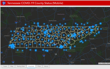
Thanks to innovative and rapidly evolving technologies, most people have GPS devices in the palm of their hands (i.e., smart phones) and unlimited access to free, open source phone- and web-based applications and programs. Through Google/Bing Maps and Google Earth you can easily and freely use multiple map backgrounds and add your own layers to display spatial information. The adjacent webmap is a bit more complex and shows all hospitals and rehabilitation facilities in Tennessee and within 20 miles of Tennessee. It is part of a Dashboard (scroll down to view the full Dashboard) that was developed in response to the 2020 COVID-19 (Coronavirus) pandemic, to be used as one of many resources for local officials and the public. Mapbox is another innovative platform - it uses the CartoCSS "stylesheet" language and can be used to create dynamic, interactive maps with beautiful styling. Check out an example that was created for Johnson City, TN and the East Tennessee State University campus (embedded below). Additionally, Carto (which uses CartoCSS) can be used to create beautiful, dynamic maps focused on Location Intelligence using PostGIS via the cloud. An example is available here showing an animation of when London's transit stations were opened, categorized by rail type. ArcGIS Online is great for creating web maps and apps and has been used for multiple classes and projects at ETSU - check out a great Story Map here, or embedded below, created by graduate students at ETSU for the 2018 SEDAAG Conference in Johnson City. The Open Source Geospatial Foundation is a great resource for finding other webmapping tools that include map servers, map publishing, and frameworks for dynamic webmapping.
When referencing text or graphics from this website, please use the following citation: Timothy Andrew Joyner. 2020. www.tandrewjoyner.com. Last accessed ?/?/20??.
